
Introduction
Color isn’t just decoration—it’s a communication tool that influences how users perceive your website, interact with it, and take action. Understanding the psychology behind colors can help you craft a more engaging user experience and drive conversions. In this post, we’ll explore how to strategically use colors in web design and provide a free tool to get started.
1. Why Color Psychology Matters in Web Design
Color affects emotions, behavior, and decision-making. On a subconscious level, it can establish trust, signal urgency, or create a sense of calm. Brands use colors deliberately to evoke these emotional triggers and guide user behavior.
Key Point:
- First impressions of a website are 94% design-related, and color is a significant part of that experience.
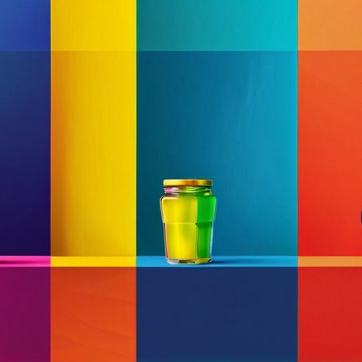
2. How Different Colors Influence User Behavior
Here’s how specific colors affect user perception and where to use them effectively:
- 🔴 Red: Creates urgency and excitement. Ideal for sales buttons and limited-time offers.
- 🔵 Blue: Promotes trust and calmness. Frequently used by financial institutions and corporate sites.
- 🟢 Green: Represents growth and balance. Perfect for eco-friendly brands and wellness sites.
- 🟡 Yellow: Evokes energy and optimism. Great for calls-to-action or youth-focused products.
- ⚫ Black: Conveys luxury and sophistication. Common in high-end fashion and technology websites.
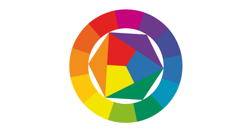
3. Tips for Choosing the Right Color Palette
Selecting the right color palette can make or break your design. Here are three essential things to keep in mind:
- Align Colors with Your Brand Identity: Your color scheme should reflect your brand’s personality to create consistency and build trust.
- Consider Cultural and Emotional Impacts: Different cultures may interpret colors differently, so research your target audience’s preferences.
- Use Contrast to Highlight Key Elements: High-contrast elements improve readability and draw attention to calls-to-action (CTAs).
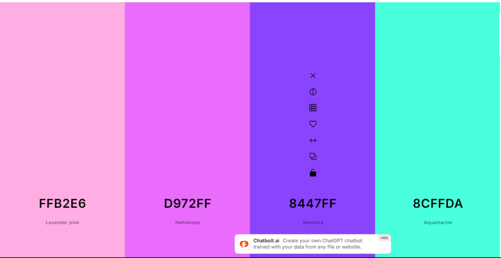
4. A Free Tool to Help You Choose the Perfect Palette
Finding the right color palette doesn’t have to be difficult. Coolors.co is a free and user-friendly tool that allows you to generate beautiful, cohesive palettes with ease.
How to Use Coolors.co:
- Click “Start the Generator” to explore random palettes.
- Lock the colors you like and shuffle the rest until you find the perfect combination.
- Export your palette and apply it to your website design.
5. Testing Your Color Palette for Maximum Impact
Even subtle changes in your color palette can affect user behavior. That’s why it’s essential to test different variations to see what works best.
Pro Tip:
- Use A/B testing to compare different color schemes and measure their impact on conversions.
- Tools like Google Optimize or VWO can help you test and analyze the results.
Conclusion
Color is more than aesthetics—it’s a critical part of your website’s user experience. By understanding color psychology, selecting the right palette, and testing your choices, you can enhance user engagement, build trust, and boost conversions.
Ready to apply the power of color to your website? Start experimenting today with Coolors.co and see the difference!
Looking for help with your website design? Contact us today for a custom web design consultation, and let’s create a site that speaks your brand’s language through color.